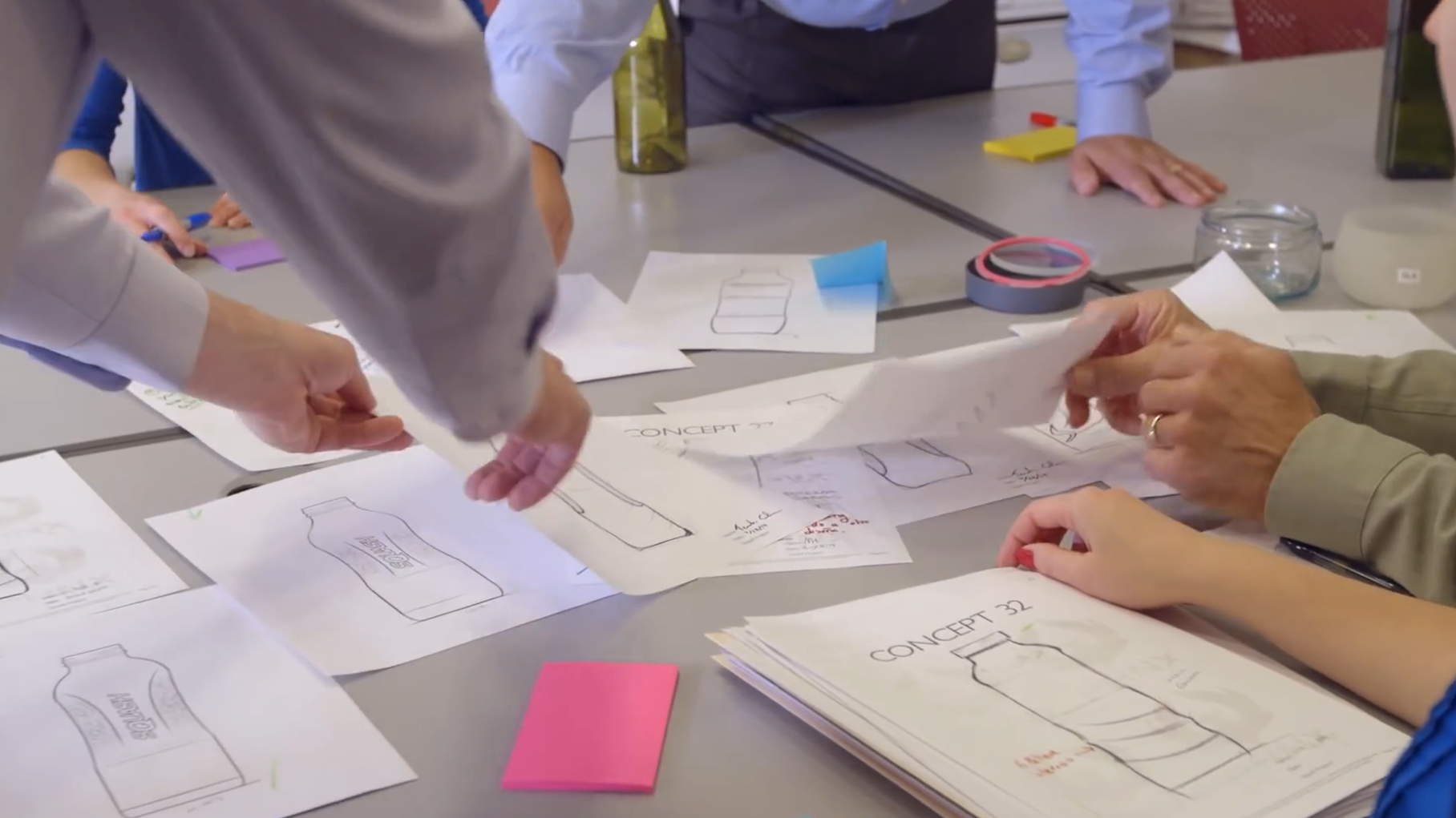
A premium spirit can justify a distinctive imported bottle when the packaging helps the brand tell a story and support its retail position. Start with the role of the packaging: a recognisable silhouette, a distinctive emblem or a presentation that makes the bottle feel like a considered gift. Those choices give a custom project its commercial purpose.
Define the brand job of the shape
A drawing becomes useful when it explains the role of the shape. A craft gin may want a confident, clean silhouette that remains recognisable across two expressions. A premium whisky release may use a heavier-looking base and a quieter label to support a gift presentation. A limited-edition spirit may need room for illustration or a numbered outer box. These are design examples, not claims that Reihey has those exact bottles ready in stock.
Keep the filled product and sales channel in view
The bottle must fit the real product and route to market. Note the intended fill volume, spirit type, target countries, expected annual programme and where the bottle will be displayed. A retail shelf, gift box, tasting room and online listing show different parts of the pack. A dramatic side profile may work beautifully in a photograph but matter less when bottles stand shoulder to shoulder on a shelf.
Treat closure and label as part of the bottle design
The neck and closure should be considered from the beginning, not selected from a photograph at the end. A cap or stopper can reinforce the bottle’s proportions, while an awkward pairing can make an otherwise attractive design feel unfinished. The same is true of the front label. A wide body may need a deliberately small mark; a narrow bottle may benefit from a taller graphic field.
Make the outer box earn its space
A premium spirit often reaches the customer as a complete presentation. The box can carry the detailed story while the bottle preserves a cleaner visual identity. It can also protect the chosen silhouette during transport. When a shape has wide shoulders, a projecting relief detail or an irregular base, packing design becomes part of the product’s economics.
The buyer brief should therefore include a preferred retail box and an export-packing concept. The two do not have to be identical. A gift box may create the unboxing experience; a separate protective shipping carton and inner support may handle distribution. Judge the finished pack and the packed dimensions together. An impressive bottle is less useful if the final assembly is difficult to ship or display.
A worked design example: a botanical spirit for gifting
This illustrative project is a fictional design brief, not a customer delivery or an available bottle model. It shows how a buyer can turn a brand direction into connected decisions about glass, decoration and packaging.
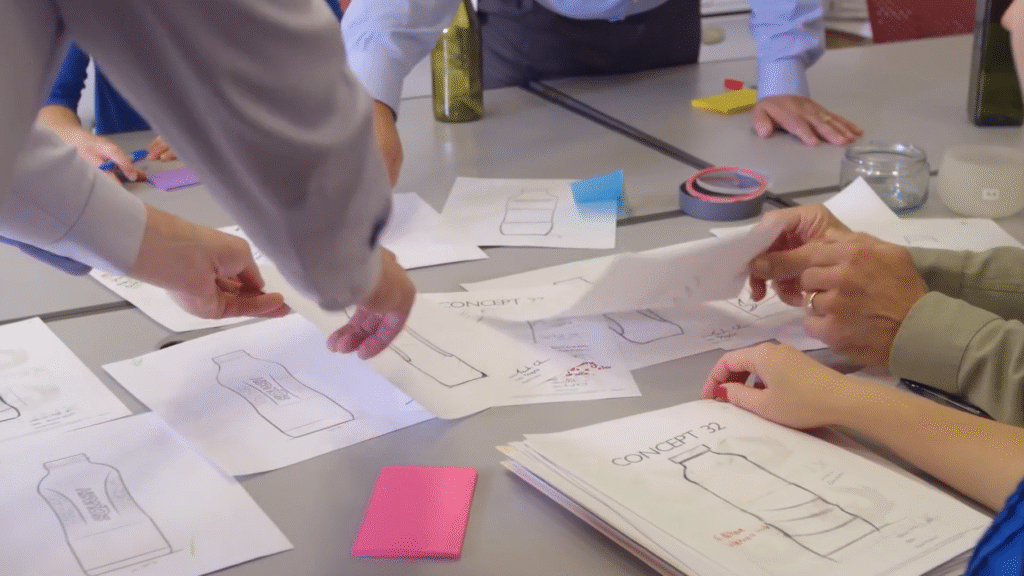
The starting brief. Imagine a premium botanical spirit sold through independent retailers and gift shops. Its identity is quiet and architectural: a vertical botanical emblem, deep green and warm ivory, with the bottle doing more of the work than a large decorative label. The main format in this exercise is 700 ml. The buyer wants a memorable front view for the shelf and a complete gift presentation for online photography.
The bottle and graphic field. The design direction uses gently squared shoulders, softened corners and a clear front panel. The emblem sits above a compact ivory label; the back label carries the longer product story. Keep a smooth landing area for the label and avoid placing a mould seam through the main graphic. Rather than widening the whole body for impact, give the shoulder its own recognisable line. That preserves the visual idea while leaving more room to develop an efficient carton arrangement.
The closure that completes the silhouette. A low-profile dark stopper top echoes the green packaging without making the neck look top-heavy. Draw the bottle and closure together in front and side views. In the sample stage, the buyer can compare the assembled proportions, opening experience and pouring feel instead of approving two separate photographs. The neck and sealing components remain part of the development specification; this visual concept does not establish their performance.
The retail presentation. A muted green gift box repeats the vertical emblem in ivory. Opening the lid reveals the bottle facing forward in a fitted support, with a short botanical story on the inside panel. Put the richer storytelling here so the glass stays visually restrained. A small tasting companion could later reuse the emblem and colour palette; it would be a separate format-development decision, rather than an assumed miniature of the same mould.
The export pack. The retail box is one component, not the whole shipping solution. Plan the fitted support, protective arrangement and master carton around the assembled bottle. Compare a narrower shoulder revision with the original concept using actual packed dimensions and the intended shipment. Keep the feature customers recognise, then remove empty space that adds no shelf value. Packing approval follows the physical sample and distribution requirements, rather than a promise attached to a rendering.
The useful outcome is a coherent design direction: one silhouette, one emblem and one presentation carried through the bottle, closure and box. A buyer bringing this brief to Reihey can discuss which elements belong in the glass mould, which can be achieved through decoration, and how the complete pack should support the brand’s selling position.
Explore packaging options
Discuss your custom bottle project with Reihey. Share your bottle direction, branding concept and delivery market so we can discuss a coordinated packaging proposal.