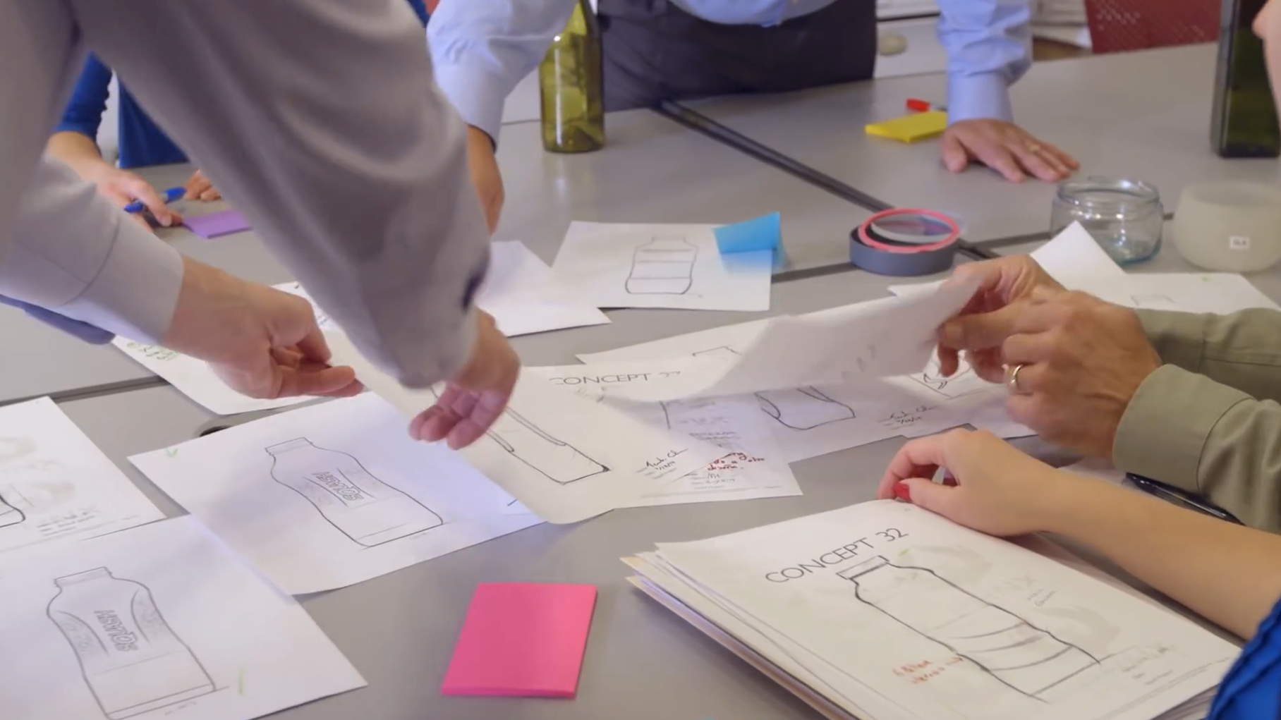
A skincare range becomes easier to understand when each bottle has a clear job. The main lotion may anchor the daily routine, while a compact companion introduces the brand or completes a gift set. Choosing those roles before choosing a long list of capacities helps a buyer build a collection that looks intentional. It also gives the supplier a more useful starting point than a request for every size in the catalogue.
Start with the product customers will remember
Identify the formula and format that should represent the range. It may be the daily face lotion, a specialist treatment or the product most often photographed on its own. This is the visual anchor. Its silhouette, colour direction and label hierarchy should make sense at normal viewing distance, without relying on the outer box to explain which brand it belongs to. A quieter companion can then borrow the same design language without competing for attention.
Capacity should express a role
A smaller bottle is not automatically a miniature of the main product. It could be a paid discovery size, a complementary formula, an introductory set component or a compact retail format. Each role has a different presentation. A discovery product needs enough room to communicate its name clearly; a gift-set companion needs to sit comfortably beside the larger item. Define the use and selling position first, then choose a suitable catalogue capacity with the supplier.
Read a capacity range as a set of options
Reihey’s clear and frosted lotion-bottle page currently lists 20, 30, 40, 50, 60, 80, 100 and 120 ml formats. That breadth is useful for exploring a family of products, but a brand does not need to launch all of them. Begin with the two or three roles that matter to the customer. A focused first range gives the bottle, label and box a clearer purpose and avoids presenting several almost identical products without a reason to choose between them.
Shape can do more than another label variation
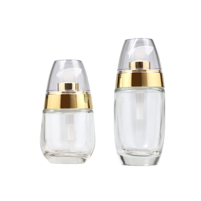
The transparent egg-shaped lotion-bottle page lists 30 and 50 ml options. Its rounded outline offers a different starting point from a straight-sided series. A buyer could use one capacity for a lead product and the other for a distinct companion, while repeating a restrained logo and colour system. This is a design direction to explore, rather than a claim that a particular complete set is available ready packed. The relationship between the two products should remain obvious when their boxes are removed.
Keep one graphic hierarchy across different sizes
Write the information order once: brand, product name, product role and required pack information. Then adapt its proportions to each actual bottle. Simply shrinking a large label can make a compact bottle look crowded. On a rounded body, a shorter graphic field may leave the silhouette visible; on a taller bottle, a vertical mark can provide continuity. Use front and side artwork views so the layout works on the physical shape, not only on a flat design file.
Let the surface support the brand mood
Clear glass can make the contents part of the presentation, while a frosted appearance can create a softer visual direction. Amber glass introduces a warmer colour character. These are useful design distinctions; colour alone does not establish a measured protection level or formula suitability. When a brand wants several looks, compare them with the same emblem and closure direction. That makes it easier to judge the contribution of the surface itself instead of changing every element at once.
Develop the closure with the bottle family
The top of the pack is part of its identity. A consistent closure colour can connect different shapes, while a deliberately different top can signal a separate product role. Compare the assembled height, the relationship between shoulder and dispenser, and the space left for branding. The dispensing configuration should suit the actual formula and intended use. A beautiful family photograph is most valuable when the assembled sample also represents the configuration the buyer is discussing.
Give the box its own useful job
A single-product box can carry a longer story and leave the glass cleaner. A multi-product presentation can explain the routine through placement: the lead product becomes the focal point and the companion sits beside it with an obvious purpose. Develop the insert around the chosen assembled formats. The gift box, its support and the shipping arrangement belong in the same discussion, because empty space and unnecessary bulk add cost without strengthening the brand experience.
Build a range that can grow coherently
For an illustrative launch, imagine one everyday lotion and one compact companion. Keep the main emblem, closure colour and typography consistent, but use a clear product-name distinction. A later treatment can reuse the visual system without copying the capacity of either original item. This is a planning example, not a delivered customer project. The useful result is an extendable design vocabulary: new products can join the collection without forcing the brand to redesign every existing pack.
Choose the next discussion around the complete presentation
Bring the desired product roles and visual direction to Reihey’s customization service. Existing lotion-bottle families provide real shapes to compare, while logo treatments and coordinated packaging can give the collection its own identity. Start with the main product and its most useful companion. Develop their bottle, decoration and box together, then expand only when another format adds a clear reason for the customer to buy.
Explore glass lotion bottles and custom decoration and packaging, or discuss your packaging project with Reihey.