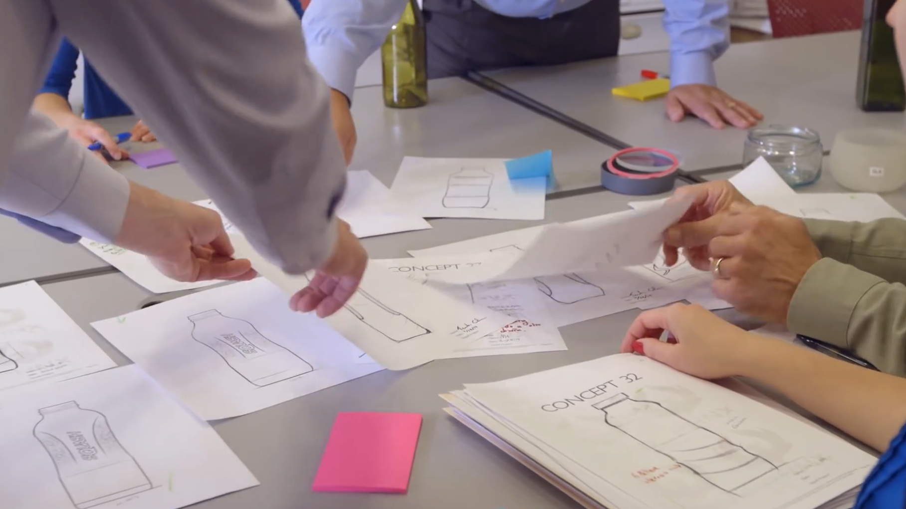
A brand reference is a direction; a decorated bottle sample is a physical interpretation of that direction. The gap between them is where many of the most useful design decisions happen. A strong sample shows how the shape, graphic, surface and closure work together. It gives a wholesale buyer something concrete to compare and helps the project move beyond a collection of attractive but unrelated reference images.
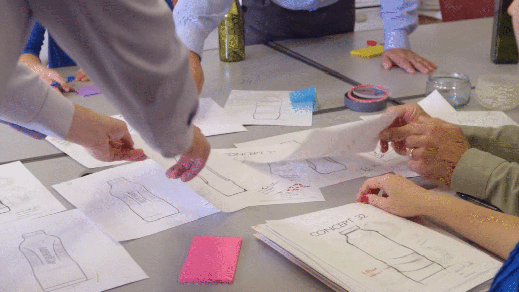
Choose the idea that should survive every revision
Start by naming what makes the intended presentation recognisable. It might be a quiet botanical emblem, a bold vertical name or a distinctive contrast between clear glass and a dark closure. Pick the leading idea before adding several finishes. If every reference contributes another effect, the final pack can lose its identity. A focused direction also makes it easier to decide whether a later change improves the bottle or merely adds visual noise.
Use a real bottle as the design canvas
Artwork needs a specific shape. A wide front panel, a rounded egg-shaped body and a narrow cylinder offer different places for a logo. Begin with an existing candidate bottle or an agreed structural concept, then establish the usable graphic field. Show the front, side and back rather than relying on one ideal viewing angle. The design should make sense when the bottle is held, turned and placed beside another product in the range.
Give each surface element a purpose
A label can carry detailed product information while a restrained bottle mark provides recognition. A colour treatment can establish a range identity; the outer box can carry the longer story. These roles do not all need to sit on the glass. Reihey’s current customization service describes routes including labels, screen printing, embossing and debossing, etching, and colours or finishes. Explore an appropriate route for the chosen project rather than treating every listed technique as interchangeable on every bottle.
Compare effects with the rest of the design held steady
When comparing two visual directions, keep the silhouette, emblem and closure concept consistent. For example, compare a clearer presentation with a softer frosted look before changing the label at the same time. That isolates the design decision and makes preferences easier to explain. A photograph can help screen the alternatives, but glass, curves and reflections change with the viewing environment. The physical sample gives the buyer a more useful basis for choosing the intended presentation.
Make colour a relationship, not an isolated swatch
The same colour direction can look different on glass, a printed label and a paper box. The aim is a coherent family, not an assumption that every material will look identical. A deep green emblem may work beside an ivory label and a darker closure even when the surfaces reflect light differently. View the components together under a consistent setting and keep the selected physical reference with the project record. That preserves the intended relationship between materials.
Include the closure in the first complete presentation
A separate cap photograph does not show what the finished bottle will look like. The top can reinforce a shoulder line or make a compact body appear unbalanced. Assemble the bottle and intended closure direction before judging the full silhouette. Graphic placement should also be reviewed with the top fitted: a logo that appears well positioned on a bare bottle may look too low once the whole pack is visible. The final configuration still belongs to the product-development specification.
Let the box extend the bottle identity
A coordinated box can repeat the emblem, introduce supporting typography and create a stronger gift presentation. It does not need to repeat every decorative effect on the glass. Keep the outside easy to recognise, then use the interior for a short story or a carefully arranged reveal. Develop any support around the assembled bottle so the front faces the customer consistently. Treat the retail presentation and protective transport arrangement as related components with different jobs.
A worked visual direction for a skincare launch
Consider an illustrative brand using a clear rounded lotion bottle, an ivory front label, a dark botanical emblem and a muted green box. The first comparison could keep the same artwork while exploring the surface appearance of the bottle. The next could refine the logo scale and closure proportions. Each comparison answers one design question. This is a fictional design exercise, not an account of a customer order, and it does not imply that the pictured combination is available as a finished stock set.
Turn the chosen sample into a shared reference
Once a direction is selected, describe the actual configuration beside its photographs: bottle identity, intended decoration area, artwork version, closure direction and packaging components. Keep the chosen sample associated with that description. The purpose is continuity, so later conversations refer to the same physical presentation rather than different screenshots. Production acceptance requirements can then be developed for the real project; the editorial example here does not establish a universal colour tolerance or a performance guarantee.
Move from inspiration to a useful supplier conversation
Reihey’s custom packaging service is a starting point for discussing the bottle and its brand presentation together. Bring a small number of references and explain which detail in each one matters. A coherent sample can then show the customer-facing idea more clearly than a long list of decorative processes. The goal is a pack with a recognisable identity, where the glass, graphic, closure and box all contribute to the same brand story.
Explore glass lotion bottles and custom decoration and packaging, or discuss your packaging project with Reihey.